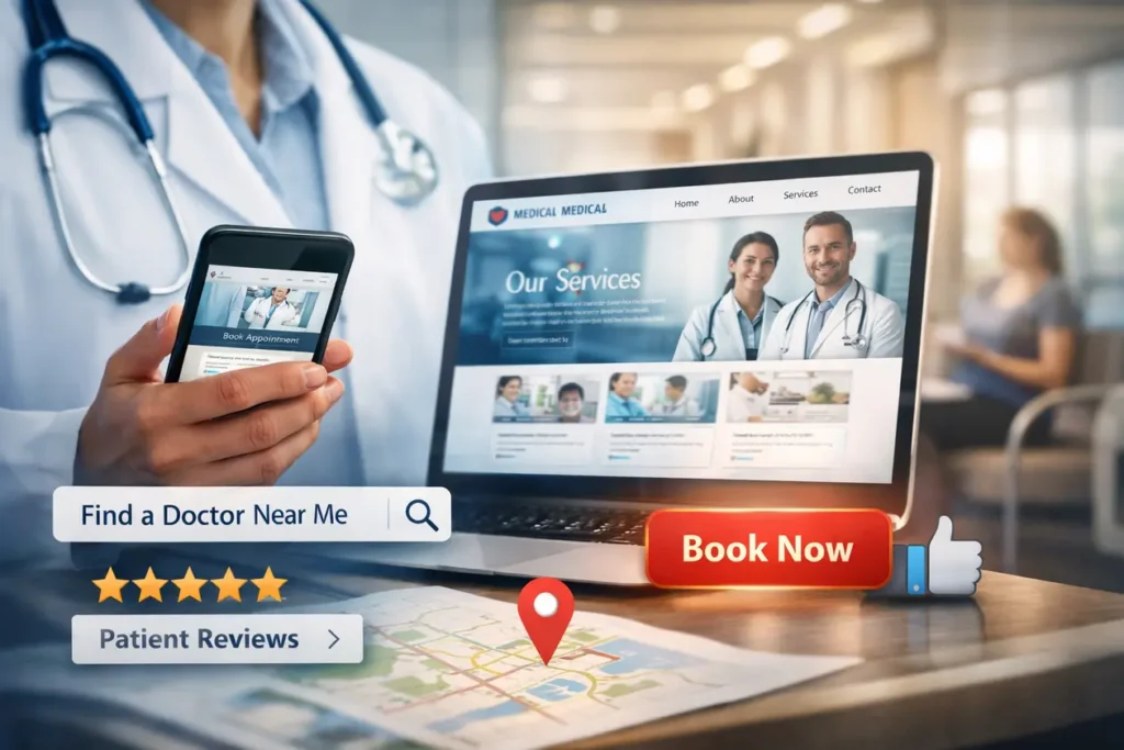
Your website isn’t just a digital business card. For most people today, it is the actual front door to your clinic. Before a patient ever calls your office or meets your staff, they are judging your expertise based on how your website looks and feels.
If your site is slow, hard to read on a phone, or looks like it was built in 2010, patients will assume your medical technology is outdated, too. Here is how to build a site that earns trust and stays busy.
What is Medical Website Design?
At its heart, medical website design is about making life easy for someone who is likely stressed, in pain, or worried. It’s the process of setting up a site for doctors and hospitals that prioritizes clear information over flashy graphics.
Unlike standard e-commerce or corporate sites, a medical website must prioritize empathy, accessibility, and authority. It turns complex clinical data into easy-to-digest information, ensuring that a patient feels cared for before they ever step into your exam room.
Why Good Design is Non-Negotiable for Doctors
You can be the best surgeon or GP in the city, but if people can’t find you online, you’re invisible. A solid website does three things:
- Starts the Relationship: Patients feel a sense of relief when they see a professional photo of their doctor and a clean office. It builds a connection before the first visit.
- Answers the “Small” Questions: By putting your hours, location, and insurance info front and center, you save your front desk from answering the same 50 phone calls every day.
- Shows You’re an Authority: When you explain treatments in plain English, you show patients that you understand their problems and have the solution.
Why Specialized Design Matters for Modern Practices
A clinic may offer world-class care offline, but if the website is slow, confusing, or outdated, patients will perceive the care as equally subpar. A strategic medical website achieves three critical goals:
- Establishes Immediate Credibility: Patients judge a doctor’s competence within the first 3 seconds of landing on their page. Professional visuals and clear credentials provide instant reassurance.
- Reduces Patient Anxiety: By providing clear explanations of procedures and showing “real” clinic environments, you lower the barrier of fear that often prevents people from seeking care.
- Streamlines Operations: A well-designed site acts as a 24/7 assistant, handling FAQs and appointment bookings, which reduces the administrative burden on your front-office staff.
10 Things Every Medical Website Needs
1. Simple Menus
When people are sick, they don’t want to hunt for information. Your menu should be dead simple: Who we are, what we treat, where we are located, and how to book. If it takes more than two clicks to find a phone number, the site has failed.
2. Real Photos of the Team
Stock photos of “fake” doctors with perfect teeth look generic. Patients want to see you. Use high-quality, friendly photos of the actual doctors, the nurses, and the waiting room. It makes the clinic feel familiar before the patient arrives.
3. Clear Service Pages
Don’t just list “General Surgery.” Create a page for each specific thing you do. Use simple headings: What is the procedure? How long is the recovery? Why choose us? This is also exactly what Google looks for when someone searches for a specific treatment in your town.
4. A Big “Book Now” Button
Don’t make people search for the “Contact” page. Put a clear booking button or your phone number at the very top of every single page. On mobile, this should be a “click-to-call” button so they can reach you with one thumb tap.
5. Patient Reviews
Word of mouth has moved online. Feature honest feedback from real patients. Seeing that others had a good experience helps a nervous new patient feel like they’re making the right choice.
6. Mobile-First Layout
Most people look for a doctor while they’re on their phone. Your website needs to load fast and look great on a small screen. If the text is too small to read or buttons are too close together, people will just hit the “back” button.
7. A Map and Directions
Embed a Google Map right on the contact page. Make sure your address is written exactly as it appears on your Google Business profile so people can get GPS directions to your door without typing it in manually.
8. An Education Blog
Write about the things patients ask you every day. “When should I worry about a fever?” or “What to expect after knee surgery?” This proves you’re an expert and helps your site show up when people search for health advice.
9. Calm Colors
Healthcare sites should feel clean and peaceful. Stick to whites, soft blues, and greens. Avoid bright, aggressive colors that might make a stressed patient feel even more anxious.
10. Security and Privacy
If you have a contact form, it must be secure. Patients need to know that their name, phone number, and health concerns aren’t being leaked. Having a “Privacy Policy” link at the bottom of the site is a simple way to show you take their data seriously.
How Medical Sites Differ from Regular Sites
A clothing brand wants to look “cool.” A tech company wants to look “cutting-edge.” A medical practice needs to look “safe.” The goal isn’t to sell a product; it’s to provide care. This shift in purpose introduces several external factors that general websites simply don’t have to worry about:
Digital Accessibility: To avoid lawsuits and help all patients, your site must meet WCAG 2.1 standards, making it usable for people with disabilities.
The Empathy Factor: Unlike standard e-commerce, your visitors are often in pain or anxious. The design must prioritize “Accessibility,” ensuring that even someone with limited vision or high stress can find help quickly.
Legal & Ethical Standards: Medical sites must follow strict government regulations. In the US, this means being HIPAA Compliant to protect patient privacy.
Search Engine Scrutiny: Google categorizes medical sites as “Your Money or Your Life” (YMYL). This means they hold healthcare sites to a much higher standard of “Experience, Expertise, Authoritativeness, and Trustworthiness” (E-E-A-T) than a hobby blog.
How to Choose Medical Website design Agency
When you’re looking for a medical website design agency, you aren’t just hiring a “tech person” you’re hiring a partner who understands healthcare law, patient psychology, and local competition.
Since a mistake here can lead to legal issues (like HIPAA violations) or just a website that looks good but never gets any phone calls, here is a simple guide on how to choose the right one.
1. Look for “Healthcare-Only” Experience
Don’t hire a general agency that builds sites for pizza shops and law firms. Medical sites have rules that other industries don’t.
- Specialty Knowledge: Can they handle the specific needs of a surgeon vs. a dentist?
- The Portfolio Test: Look at their previous work. Are the sites easy to navigate? Do they feel “calm” and professional? If all their sites look like cookie-cutter templates, move on.
2. Ask the “Big 3” Technical Questions
Before you sign anything, ask these three specific questions to see if they really know the medical field:
- “How do you handle HIPAA and data security?” If you have a contact form, the data needs to be encrypted. If they don’t mention SSL certificates or secure hosting, they aren’t for you.
- “Is the site ADA compliant?” Medical websites are legally required to be accessible to people with disabilities (like those using screen readers). A good agency knows this is mandatory.
- “Who owns the site when it’s done?” Some agencies “rent” you the site. Make sure you own the domain, the design, and the content once the final bill is paid.
3. Check for “Local SEO” Strategy
A beautiful site is useless if it’s on page 10 of Google. Ask the agency how they plan to make you show up for searches like “Pediatrician near me” or “[Your City] Cardiology.”
- Content: Do they write the medical content for you, or do you have to do it?
- Google Maps: Will they help you set up and optimize your Google Business profile?
4. Evaluate Their “Post-Launch” Support
Websites are like cars; they need oil changes.
- Maintenance: Who updates the plugins and keeps the site from breaking?
- Updates: If you hire a new doctor or change your hours, is it easy to update the site?
- Training: Will they teach your office manager how to make basic changes, or will they charge you $100 every time you need to fix a typo?
Red Flags to Avoid:
- The “Everything” Agency: They claim to be experts in every single industry.
- Guaranteed #1 Rankings: No one can guarantee the #1 spot on Google. If they say they can, they are lying.
- Super Low Prices: Cheap sites often skip security and accessibility, which could cost you thousands in legal fines later.
Final Thought
Your website is working even when your clinic is closed. If it’s designed well, it’s constantly educating patients and filling your calendar. It’s the most important employee you have because it’s the one that makes the very first impression.often the first doctor-patient interaction, before the appointment, before the phone call, before stepping into the clinic. When done right, it becomes your most reliable assistant, guiding patients from curiosity to clarity to consultation.