Imagine walking into a shop where the lights are too dim, the aisles are messy, and the cashier is nowhere to be found. You’d leave, right? A bad website feels just like that to customers.
Your website is your online shopfront. If it’s confusing, slow, or not working properly, visitors won’t stick around. They’ll leave and probably never come back.
But don’t worry. Fixing these common web design mistakes isn’t hard, and you don’t need to be a tech genius to do it. Let’s take a look at what’s scaring away your customers – and how you can fix it.
1. Slow Loading Websites – Nobody Likes Waiting
The Problem:
If your website takes too long to load, people will leave before they even see what you’re offering. Think of it like waiting in line for food at a restaurant – if it takes too long, you’ll just walk away and eat somewhere else.
Why It Happens:
- Your images are too big.
- There are too many fancy features slowing things down (animations, pop-ups, etc.).
- Your website host isn’t reliable.
How to Fix It:
- Shrink Your Images: Use tools like TinyPNG to make your images smaller and faster to load.
- Simplify the Design: Remove unnecessary animations, videos, or features that slow things down.
- Choose Good Hosting: A reliable hosting service will keep your website fast and responsive.
Quick Check: Visit your website on your phone. If it takes more than 3-4 seconds to load, it’s time to speed things up.
Why It Matters:
People don’t wait around. A slow website feels like poor service, and customers will move to your competitors.
2. Complicated Menus – Where Am I Supposed to Go?
The Problem:
If visitors can’t figure out where to click, they’ll get frustrated and leave. Imagine a grocery store with no signs – you’d have no idea where to find anything.
Why It Happens:
- Too many options in the menu.
- Unclear labels (like “More Stuff” instead of “About Us” or “Our Services”).
- Important pages (like “Contact Us” or “Shop Now”) are hidden or hard to find.
How to Fix It:
- Simplify the Menu: Keep only the most important links – like Home, Services, About Us, and Contact.
- Use Clear Names: Use labels that people understand. Instead of “Our Journey,” just write “About Us.”
- Highlight Key Buttons: Make buttons like “Buy Now” or “Contact Us” bold, visible, and easy to click.
Quick Example:
If you’re a local bakery, your menu should look like this:
- Home
- Our Menu
- About Us
- Order Now
- Contact Us
Simple, right?
3. Too Much Clutter – Less is More
The Problem:
When your website has too much going on – too many images, pop-ups, text, and colors – visitors feel overwhelmed. It’s like walking into a messy room; they don’t know where to look, so they leave.
Why It Happens:
- Adding everything at once – banners, animations, pop-ups.
- Too many fonts and colors fighting for attention.
- Long, chunky paragraphs that look hard to read.
How to Fix It:
- Clean Up the Layout: Use a simple design with plenty of white space (blank space is good – it helps people focus).
- Stick to 2-3 Colors and Fonts: Keep things neat and consistent so your site looks professional.
- Break Up Text: Use headings, bullet points, and short paragraphs to make reading easy.
Quick Example:
If you own a small gym, don’t flood your homepage with photos, videos, and ads. Keep it clean:
- A big image of your gym.
- A short headline: “Join the Best Fitness Center in Town.”
- A button: “Sign Up for a Free Trial.”
Simple and clear.
4. Not Mobile-Friendly – It Needs to Work on Phones Too
The Problem:
Most people browse websites on their phones. If your site looks weird, has tiny text, or doesn’t fit the screen, they’ll leave immediately.
Why It Happens:
- Your website wasn’t built to adjust for mobile screens.
- Buttons or menus are too small to tap on a phone.
How to Fix It:
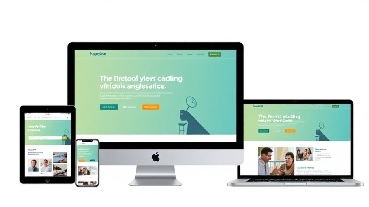
- Make It Responsive: Ensure your website automatically adjusts to fit any screen – mobile, tablet, or laptop.
- Test Your Site: Open your website on your phone. Are the text, images, and buttons easy to use? If not, it’s time for a fix.
- Simplify for Mobile: Use big buttons, large text, and a clean layout.
Quick Example:
If you’re a clothing store, your “Buy Now” button on mobile should be big and easy to tap – not hidden in a corner.
5. No Clear Call-to-Action (CTA) – What Do You Want Me to Do?
The Problem:
Visitors need to know what to do next. If you don’t tell them clearly, they’ll leave without taking any action.
Why It Happens:
- Buttons are unclear, like “Learn More” instead of “Contact Us” or “Shop Now.”
- There’s no obvious next step for visitors.
How to Fix It:
- Be Direct: Use simple action words like “Book Now,” “Call Us,” or “Shop Now.”
- Make CTAs Easy to Find: Place them where visitors can see them easily – at the top, center, and bottom of the page.
- Keep It Simple: Each page should have one clear action. Don’t confuse visitors with too many options.
Quick Example:
If you’re a home decorator offering free consultations, your button should say:
“Book a Free Consultation” – bold and right in the middle of the page.
6. Outdated Content – Is This Business Still Open?
The Problem:
Outdated content, like old events or broken links, makes your website look abandoned. Customers might wonder if you’re even still in business.
Why It Happens:
- You haven’t updated your website in months or years.
- Old blogs, expired offers, or broken pages are still live.
How to Fix It:
- Update Regularly: Check your site every month to make sure everything is current.
- Remove Old Content: Delete expired promotions, events, or broken links.
- Add Fresh Content: A new blog, new products, or recent updates keep your site looking active.
Quick Example:
If you’re a salon, replace old offers like “Winter 2022 Specials” with something current, like “Summer 2024 Packages.”
Conclusion
Your website is like your digital shopfront – it needs to be clean, clear, and easy for customers to use.
Here’s the simple truth:
- A slow site frustrates visitors.
- Complicated menus confuse them.
- Too much clutter overwhelms them.
- A mobile-unfriendly site drives them away.
- No clear buttons mean they’ll leave without taking action.
Fixing these mistakes doesn’t have to be hard. Start small – clean up your design, improve your speed, and focus on the experience your customers need.
Need help fixing your website? At RankVed.com, we design websites that not only look great but work flawlessly to attract and keep customers. From fast performance and clean design to mobile optimization and clear calls-to-action, we take care of it all. Let’s build a website that works for your business – and for your customers.

